So in this last post, I started, and arguably finished, making a new watch face for a Fitbit Versa 3. This time, I’m gonna drag you with me as I relive how I tried to make the steps ring fancier, and how it blew up in my face.
Also this time, I’ve got all the busted code saved on a git repo, so I can easily pull it back up to get recordings and screenshots.
Emphasis on “recordings”.
Shit got weird, and it turns out that the emulator software and the actual watch firmware differ in a few undocumented ways that I stumbled into face first.
Quick recap
For those who aren’t too interested in reading a 4000 word Lanta special (I’ll try and make this one not be 4000 words this time,,,) here’s the quick where I’m at, what I was going for, and what’s next.
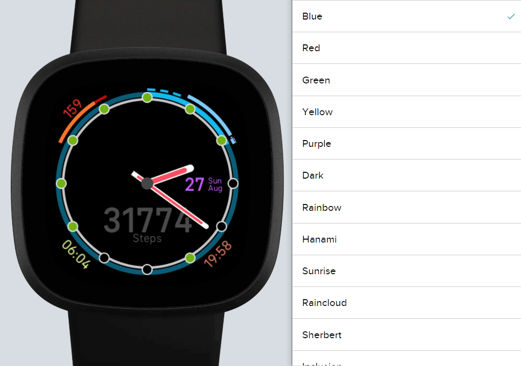
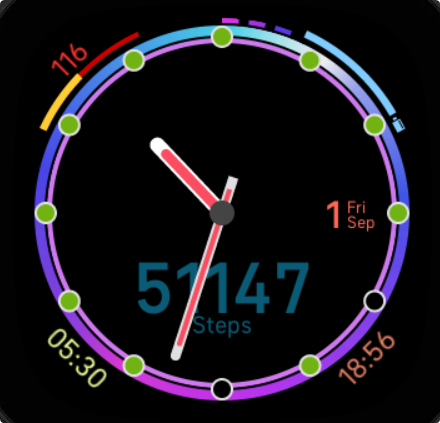
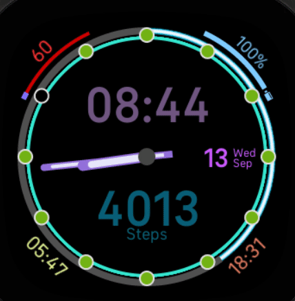
Hourly Steps by MC11010 for Versa, Versa 2 and Ionic
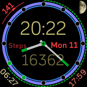
In the middle:
- Analogue clock hands
- Digital clock
- Date
- Statistics display that cycles between various values
On the bevel:
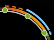
- Ring indicating steps progress to daily goal
- Ring indicating hourly steps progress to 250
- Pips indicating which hours the steps goal was met
On the outside:
- Heart rate
- Sunrise/set times
- Moon phase
- Ring indicating battery level (When the dotted ring empties, the battery is at ~10% remaining)
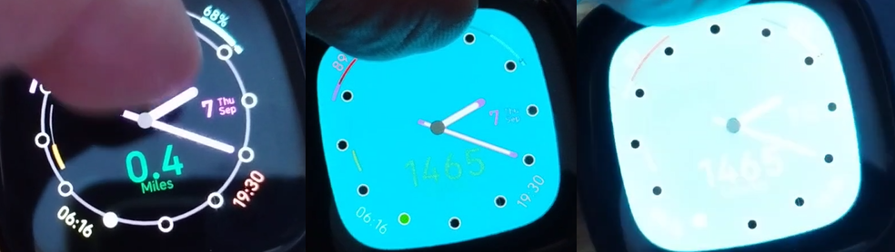
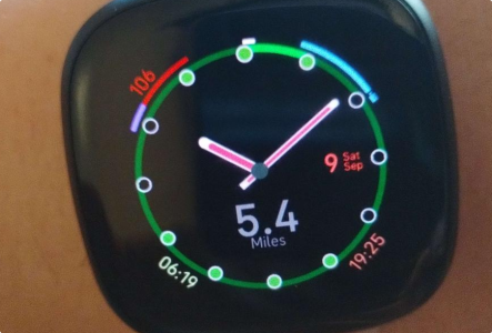
Hourly Steps Redux by Rocketlanterns for Versa 3 and Sense
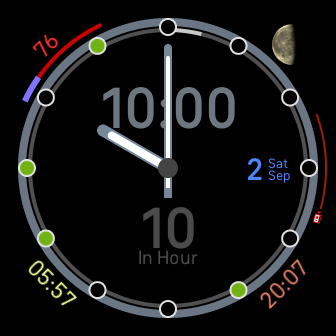
Middle is the same, though I moved a label and changed the clock hand design, as well as making each text element individually toggleable.
Bevel is the same, though I added an option to make the outside ring display the currently viewed statistic rather than always showing steps.
Outside is mostly the same though I changed the battery ring to a meter, and made each element toggleable.
What else is there to do? Looks pretty complete to me.
- I want to add better customisation for the bevel ring, ideally I want to be able to implement gradients.
- I also may attempt to add additional watch face styles, but I’d have to come up with names for each style if I wanted to use a picklist in the settings instead of a colour set.
- Possibly add some settings to add/remove elements from the statistics wheel.
- Disable floors/distance/calories/zone minutes.
- Enable heart-rate/battery%/date for users that decided to hide these from the corners to clean things up.
And also maybe some other stuff, I’ll talk to my brother who also uses the Versa 2 version of this watchface and see if there is anything he’s missing that I might be able to add.
Gradient rings, or how I accidentally blew my watch screen up that one time
So here’s the thought process.
- The screen SVG version that fitbit uses provides an element called <gradientRect>, with one of the options being a bilinear gradient.
- There is also an element called <mask> which lets you place some objects in a mask, drop that mask on top of a nested <svg> and the only pixels that are drawn are ones corresponding to opaque pixels in the mask.
- If I put the arcs in the mask and then the mask on the gradientRect, then the arc will take on the colour of the gradientRect.
On paper, sounds flawless.
Spoilers though, it didn’t work.
Let’s get into it.
The Theory
So there are 4 rings that compose the bevel of the watchface. Two for the thick outside ring, and two for the thin inside one. These pairs each provide a background colour and a foreground colour. At all times, the background colour has a span of 360 degrees, and the colour is (in the current state) either a grey for when the goal has not been met, or the colour of the most recently filled ring for when the goal has been met.
The foreground ring is the one that actually indicates the percentage of goal that the statistic is, and as such the span angle is dynamically set. The colour of the foreground ring is always going to be the current colour.
When a ring fills up, if there is another colour to stack on top of it, then the background is changed to the current colour, the foreground is changed to the next colour, and the span of the foreground is set to 0.
So with this mechanism in mind, converting to gradients should be a pretty one-to-one shift.
We define 4 masks, each housing one of the 4 rings, and then we specify 4 gradientRects, each one corresponding to a mask, then stack them all together in the relevant location.
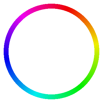
Rainbows!
Sort of.
The underlying gradient rect here actually has orange in the top right, green in the bottom right, cyan in the bottom left, and magenta in the top left, and then all the blending is done via a bilinear gradient.
Definitely looks like rainbows though!
There is one other thing I needed to test though, how to dim this down. If I’m gonna be using gradients, I don’t want to have to hand pick quads of colours to decide the colour of each layer. Though writing about it after the fact, I realise this could lead to some super cool designs where the second ring layer is completely different to the first one, but unfortunately due to reasons this wouldn’t have been possible anyways.
Let’s put together a tiny demo just to see what happens:
<svg>
  <mask id="mask">
    <rect x="0" y="0" width="20%" height="100"/>
    <rect x="20%" y="0" width="20%" height="100" fill="#808080"/>
    <rect x="40%" y="0" width="20%" height="100" fill="#00ff00"/>
    <rect x="60%" y="0" width="20%" height="100" opacity="0.5"/>
    <rect x="80%" y="0" width="20%" height="100" opacity="0"/>
  </mask>
  <svg width="100%" height="100%" mask="#mask">
    <rect x="0" y="0" width="100%" height="100%" fill="#ff0000"/>
  </svg>
</svg>- 0% is the base case.
- 20% (fill=#808080) is testing if the colours are multiplicative
- 40% (fill=#00ff00) is testing if any channel shenanigans are happening
- 60% (opacity=0.5) is testing if I can blend with the background
- 80% (opacity=1) is testing if I can hide the colours.
And for reference “blend with the background” when the background is black is just a straight darkening.
And we get this:
This tells me that the only component of the mask that’s relevant is the opacity of each pixel, not its colour, but also that I can have parts of a mask that do not get drawn, or that get drawn translucently.
And drawn translucently gives me a number of ways of modifying a specific gradientRect before it gets drawn, by blending it with something else.
And if we follow this train of logic, I just need to define the colours for a gradient once, then when I use that gradient as the background, I can dim it by blending it with black to give a level of contrast between the foreground and background rings.
Of course this strategy falls apart if any of the blending colours are too dark, but we can just design around that.
So how far did this strategy get you?
Well, let’s take stock:
We have 2 pairs of 2 rings. The background ring has an opacity of 0.5 in order to blend with the black background and darken whatever is displayed.
We have a mask for each ring, totalling 4 masks.
We have a masked gradientRect for each ring, totalling 4 gradientRects. (There is an optimisation here that I’ll make later, don’t worry about it for now.)
We have some colours that we want to use for each colour.
Each ring colour scheme can either be a solid colour by setting all 4 bilinear colours to the same value, or a linear gradient by pairing off colours, or a bilinear gradient. Theoretically we could do a sort of pseudo radial gradient by setting 3 corners the same, but since only a small ring around the outside is required, we just need to worry about the gradients between each of the corners.
So we just put it together, shuffle around some arc IDs, set the background colour to grey on the first loop, or the loop colour after, and we encounter one more little problem, quite a simple one: We only get 1 dimmed colour.
We can fix this though, I decided to fix this with a tiny nod towards the original clockface’s battery ring:
I could fit 3 before crashing into the battery ring, and I added these to the mask layer with the outside ring so that they shared a colour. Each of these dashes indicates 1 full ring, so in this screenshot, the watch is reading 3 full rings and then another 20%-ish on top of that. This both allows us to see the number of complete rings, whilst also having more clarity between what’s illuminated and what’s dimmed on the ring itself, instead of just using 3 similar but distinct colours.
I also added a toggle to the settings labelled “Ring Overfill Style” which goes between:
- Disabled (When the ring fills, it’s full and that’s it. The in-hour steps ring always acts like this.)
- One additional ring (When the ring fills, it dims, and a second ring is drawn on top. This is the maximum value for the inside ring, since the additional pips don’t exist on the inside.)
- Three additional rings (This is the pips above. After 3 extra rings, the bar just stays full like normal.)
So all that’s left now is to just define a few gradients.
To start with, I mostly designed to plagiarise borrow for testing purposes some of the gradient themes built into Discord, as well as a few I designed myself.
Looking good!
Now for the real test, Installing it on my watch.
Strobe / Flashing Lights Warning. This video contains full screen flashing, do not watch if you’re sensitive to that sort of thing. (Choice screenshots below the video so that you’re not left out.)
For those who can’t watch the video, thank you for your patience. Here’s some frames of what went wrong.
So, a couple of errors here: The ring isn’t being drawn at all, not great. And when it does try to draw, it seems like the mask is wigging out and just drawing the entire screen in that colour.
So after a bunch of googling about what went wrong, it turns out there are a few known bugs that may be the potential cause, though I don’t know which one is specifically at play here.
- Some people have reported seeing issues when rects/gradientRects are interacting with circles/arcs in masks that cause issues with the mask not being applied properly.
- Some other people have reported seeing issues when an object on the masked SVG (or the mask itself) goes outside the bounds of the screen as part of its final transform.
- Yet another group of people have reported seeing issues with masks overlapping with each other having one mask cancel or block another.
Now here’s the thing: I kinda hit all three of these. I have 2 masks occupying exactly the same space in multiple places, each of which being an arc on top of a rect, and the rects under the mask are full screen and sometimes rotated outside the screen.
So, not looking promising.
At this point I just committed all the changes to a new branch, rolled back to the last point where it worked, and loaded a working patch to my hardware before going to sleep.
For about uhhhh
lets say a week
probably.
gnight.
1 Week Later
So I was at work in the London office when I had a realisation:
I could probably at the very least make the outside ring work as a gradient within the bounds of the hardware limitations/bugs outlined above, even if I couldn’t do the inside ring at the same time.
I mentioned optimising stuff, and that’s just what I did.
Did you notice how in every case, the background ring was either a grey or a 50% opacity copy of the foreground?
Why don’t I just make the background grey be an arc outside the mask, and when the ring fills, I set the background colour sweep angle to 0, and a 50% opacity mask sweep to 360?
So I did, and impressively it worked!
It only worked on the outside ring since I can’t stack masks, but it still worked! Even on hardware!
Next challenge: Figuring out how to rotate the gradientRect without it leaving the screen.
Intricacies of the gradientRect element
So when defining a gradientRect, you have to specify 9 arguments, and then 2 or 4 colours.
- x, y, width, height: These are inherited from a <rect> and define the placement and size. We can make these 0, 0, 100%, 100%.
- gradient-type: either linear, bilinear, or radial.
- gradient-x1, gradient-y1, gradient-x2, gradient-y2: These specify a pair of coordinates for the gradient. Think like in PSP, PDN, or Gimp when you drag the gradient tool between 2 points.
- gradient-color1 – gradient-color4: The colours. For linear and radial, only 2 colours are used.
So my theory was that perhaps I could rotate a gradient by moving the gradient x coordinates relative to each other to skew the final output.
So I set x1 and x2 both to 50%, and then… it drew nothing.
And that’s when I internalised how bilinear gradients actually work, because it’s not like a regular linear gradient with extra colours on the left/right of the main line.
There is one strictly horizontal gradient between x1 and x2, and one strictly vertical gradient between y1 and y2, and it just blends the two gradients together. Now that I think about it, that makes sense, but I wasn’t expecting it to begin with, so uhhhhhh, yeah.
Lilla Oshisaure dives in for the incredible save!!!
“Why not just use images?”
Wait, what do you mean? How does this solve that I can’t rotate elements outside the bounds of the screen?
“That’s the trick, you don’t have to, you can just make your pre-rotated gradients as images”
Holy shit you might be on to something sweetie, I’ll be right back.
.
..
…
>700kb
Some calculations later…
Okay, so basically when I upload the .fba bundle to the Fitbit Gallery, I have a limit of 10MB. If I take into account that I’m going to need 2 variants for each image (one for the outside ring and one for the inside) then I still have more than enough room for at least 50 of these images!
And since PNGs play nicely with transparency, I can place a second smaller ring img into the gap in the middle of the first one, then place both imgs into the same masked svg element, move all 4 of my rings into the mask, and boom, finally gradients that play nice with the hardware!!!
Lilla get over here and look at what I did with your idea
“:o rainbow”
Thanks Lilla <3
So that’s about where I’m currently at. My next task is to design all the gradient options I want to include into the app, and then bundle them up to work properly!
This is one that Lilla designed herself, and it’s doing 3 interesting things: First, it’s so clearly not a rotated bilinear gradient, secondly because the outside ring image is just a masked off PNG, we can manually change the base image colour where the dotted pips on the outside would be in order to set those colours separately, and third, well, look at it, it looks rad as hell.
One thing I could experiment with that I also couldn’t do with just a rotated gradient is to add patterns, maybe add in some funky moire patterns, or stripes/dots, lots of options.
Oh, the settings too.
Turns out in the JSX definition for the settings, you’re able to change the render mode of a Select option from Text to ImageTextRow, which lets me assign an image to each option so that users can see what they are.

It looks a little scuffed, and that’s because these icons are actually 32x32px PNG data embedded directly into the code as a base-64 datastring so that there are fewer files to import. I’d say they inflate the size, but the most any of these get is like 16kb of text, which is more or less nothing.
I can also use this strategy of adding little icons to the watch face style selector too.
Finally done with gradients, Let’s do something else now.
God fucking damn it I’m already 2.7k words in and I still have so much more that I want to talk about.
Just kidding!!!
So It’s a new day, and I’ve been outside with Lilla and gotten my 10k steps and 5 miles, and uhhhh, it’s not looking good chief:
The inside ring vanished as soon as I tried to enable opacity on the outside ring!
Wahoo this is a problem.
So looks like the issue right now is that mask layers can’t have multiple levels of opacity on them or else the hardware breaks, somehow.
I tried to split the opacity into two different mask layers and apply one after the other, but that didn’t work either, so I don’t fully know what I want to do at this point about it.
Maybe I could assign a different solid colour to the background on full rings?
I might also have to get rid of the +1 overflow setting and have overflow just be a toggle between off and +3.
The only thing I haven’t tried yet is having two identical image layers, but I fully expect that to just blow the screen up like before. I’d say that’s what nesting the masks did, but that instead gave me the wonderfully cryptic bullshit error message “Critical glue error”, to which my only response is that perhaps the firmware developers are suffering constant critical skill errors.
More flashing lights warning in following video
So that didn’t work either.
I think the only option now is to just update the background, and have that choose a relevant “I’ve been filled once already” colour for the foreground to sit on top of. What a pain, but oh well.
There is also like, a small amount of “mask broke” when the watch is drawn for the first time, meaning that the entire underlying image is briefly shown, so I made the underlying images about as small as I could to ensure the entire mask is covered by the image. This means that the flickering now only shows the ring itself being full before being masked away.
Brief investigative aside
So I was thinking about some other things I could do on the watch face, and was in the car with Lilla on our way to a beach (Specifically we went to Clacton, was a nice evening,) and I got a bit curious on the drive there, so I spent a bit looking into tidal predictions.
Turns out my naïve view of the tides being related to the moon is incredibly overly-simplistic, and there are a ton more factors that affect tidal forces, so unfortunately I can’t really know when high/low tide times are just using the moon’s position and some GPS coordinates. Oh well.
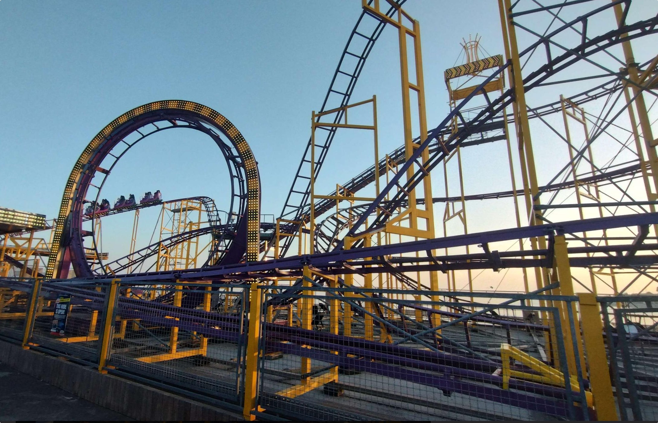
Here’s a picture of a roller coaster that we saw while at the beach instead.
Choosing what to show in the middle of the clock face
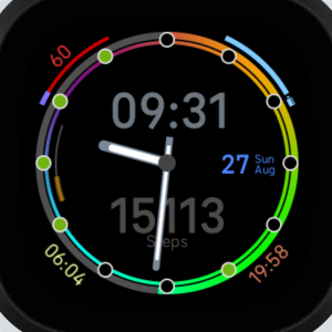
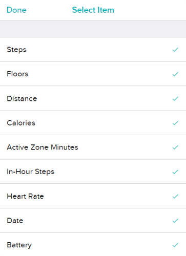
The current list of stats is nice, but perhaps there are some people who want to see less, or some people who hide specific elements but still want to access them. Thats where the changes to the middle of the screen come in. And also in fairness, heart rate was already one of the stats in the middle of the screen on MC11010’s version, so this isn’t too too far out of left field.
Heres some notes about my implementation:
Each stat in the center of the screen comes with 4 attributes: A label, a colour, an inner ring stat, and an outer ring stat.
Notably, the ring stats do not have to include the displayed stat itself.
This is important because rings are calculated by comparing data.today with data.goals, and those variables come directly from fitbit.
The displayed text is directly taken from data.today. This means I can inject more options by appending to this data object,
But since the values I’m injecting are strings (e.g. “144 :”, “Wed 13”, or “69%” nice) I can’t then divide them by an equivalent key in goals, meaning we can’t have our extra data populate a ring.
All that being said, since the clockface is called Hourly Steps, all the extra data will just point at the hourly and steps rings. That just seems to be the easiest way about it.
So what extra values can we add? Like I’ve already said, I want to give an option to view hidden fields, so for now I’ll add heart rate, date, and battery. Of course I can have them disabled by default.
Fun fact: This menu on android looks like a set of radio buttons. That you toggle on and off individually. Ah I do love some radio checkboxes. Someone needs to slap the UI designer for me.
I do have to do a small amount of tweaking throughout the codebase to have the HRM and battery methods update some variables relevant to this to make it work, but that’s not the end of the world. (Whoops, kon’s spaghetti.) And now I have this:
The colour scheme here is slightly broken, something isn’t updating where it needs to be, so I’ll hunt that down now. The colour of the heart rate (and battery) is supposed to dynamically change based on the colour of the relevant element, and while the underlying code is there to initialise it like that, it seems that it’s not updating properly after being initialised.
Another thing to notice is that all the stats ring are using the same 3D aesthetic now. This is actually a nice QOL/consistancy feature I added where if the selected steps ring is one of the neon tubes, all the other rings will switch to the same, using the same colour coding as the flat rings.
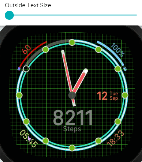
Accessibility font size
Some of the fonts are a bit small. I want to make them customisable. I’ll do it in groups of similar font size elements, and allow each group to be scaled up to 50% larger (in steps of about 5%). This should make everything easier to see for people who need it whilst allowing people who don’t to keep the screen less cluttered overall.
So first up, corner text: This stuff is (mostly) font size 24, so we’ll just add a slider from 0-12 and add that much to the font size, and call it good right? Well, there is one extra consideration: Font sizes are anchored at the bottom of the text, not the middle. This means that for the sunrise/set times I’d also need to nudge the text down. Thats fine though, I can use the same 0-12 slider as a movement offset. Both of the times at the bottom are pinned to the X axis and then rotated, so I don’t even need to do complex calculations to figure out where to reposition to, just nudge directly down.
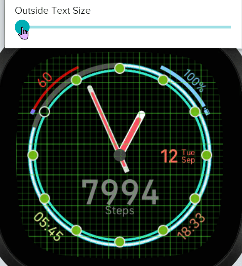
Oh. It’s not growing. Moving works fine but it’s not growing, but the top is?
Here’s what’s going on: Because I’m changing the style.fontSize attribute, it’s changing the size of any text that gets drawn by that element, but the text thats already there doesn’t automatically get updated. The reason that the battery text is working as intended is beacuse earlier on in the settings call, the battery is force updated (by the reserve battery setting needing to redraw the bar and potentially recolour the text.) The method I call just does everything at once including redrawing the text, so it all works.
So the fix is simple, just do SunriseText.text = SunriseText.text after changing the font size and it’ll update the text buffer too:
The second element to resize is the date: This one is instead going to use groupTransform.scale in order to not deal with having to reposition each text element relative to eachother (like, they’re super annoyingly tuned to look right.) So all I need to do is use the input slider value to get a scale factor between 1 and 1.5 (and some extra calculations for left nudges), apply the scale and translation, and we’re done.
Thankfully when scaling and translating the same group element, the scale operation is always done first. That means that since the entire block is centered around the origin, it scales evenly in all directions.
No gif for this one, sorry.
The inside text is also a scale and translation nudge. The translation just applies to the clock to balance it slightly better, since in this case, like the font size, the scale is done around the bottom center of the text for the big numbers, though the label is slightly below the origin, which is actually perfect for this. I’d call it foresight, but in all honesty it’s blind luck.
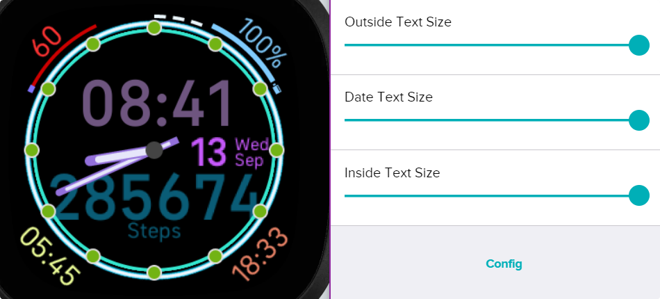
Ah, it looks gross i love it. To be honest, if I just move the label to the right of the hands, this is probably the closest I’ve ever been to looking like MC11010’s original design.
Once again, I’m done.
With those changes, I’m more or less mostly happy with the state of the clockface, all I have left to do is design around 10 or so more ring designs. Full list can be found in an appendix below or something.
The clockface is stil private but the version I’ve built over the course of this post is available on the gallery via this link, I’ll give it a few weeks while I figure out if there is anything I’m still missing or could still do, then I’ll submit it for review and get it published properly (Once published, I can’t make any more changes.) Hopefully all goes smoothly.
With all the work I’ve put into this now, it feels less like a remake of MC11010’s Hourly Steps and more like my own take on the entire concept. To the point where I’m renaming mine to just Hourly Steps. Multiple apps with the same name isn’t actually a problem on the Fitbit Gallery.
Big stack of colour gradient designs.
Each gradient design comes with an outer and inner design, as well as an icon for the settings app, technically a flat colour for the background too, which I suppose I’ll indicate with font colour.
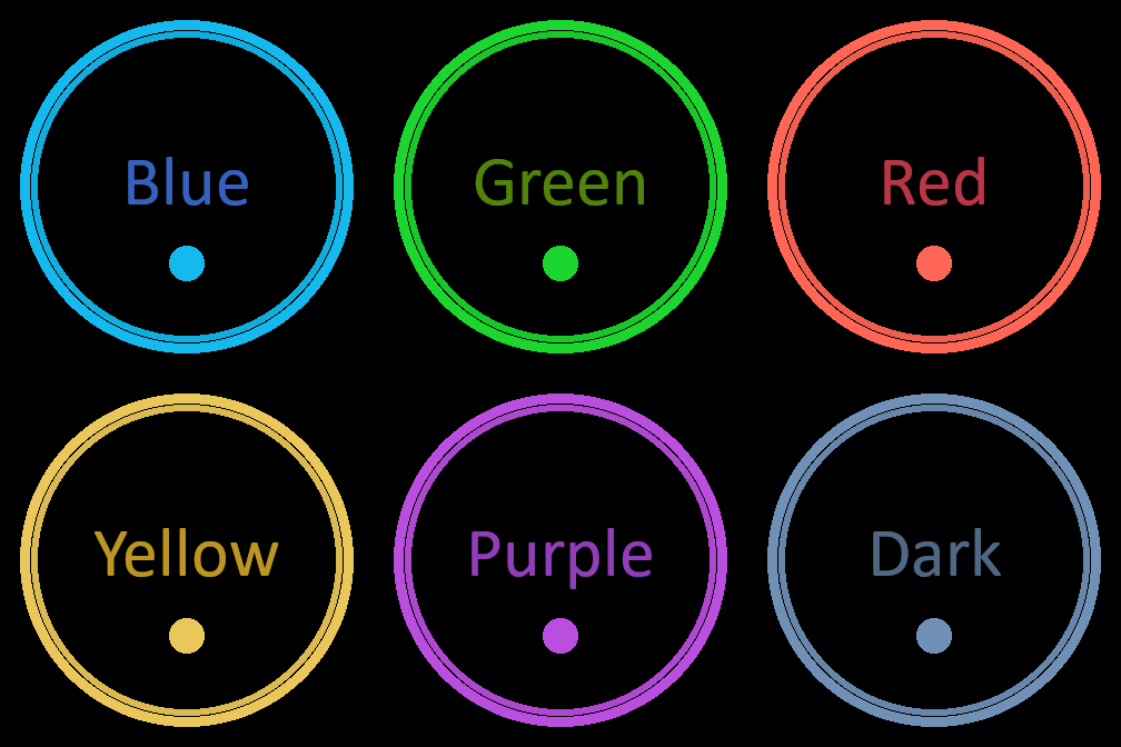
Flat colours:
These are just the 6 default colours that have been following me around the whole time. There are also flat versions of the inside rings that are exclusive to the In Hour steps ring which are each lighter than the corresponding step ring colour.
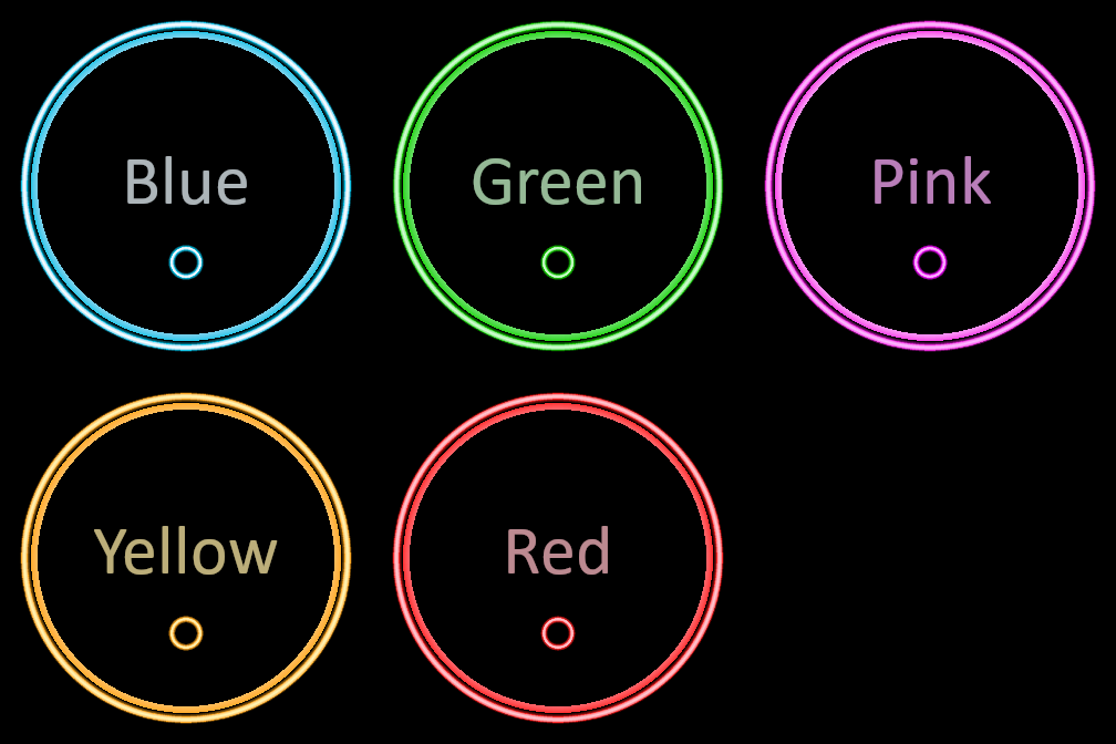
Neon Tubes:
The inside ring for each of these actually has a tiny lick of gradient to them to make them feel slightly less flat too. The outside is designed on a neon lamp tube, but on actual hardware it essentially gives a more 3D effect to the design. Since this design was so unique yet versatile, I decided to implement a small thing where if the steps ring is a neon design, all the other stats rings will share the neon aesthetic, with the default flat colour being replaced with the neon equivalent. I initially wasn’t going to have neon red, but needed to create one for this to work.
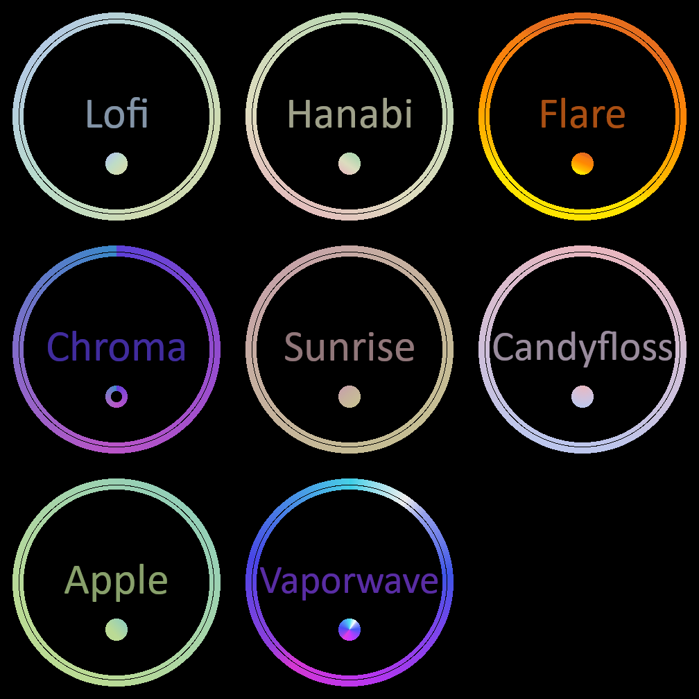
Gradients:
Some of these have been taken from or at least inspired by some of the Nitro themes built into Discord, but we also made our own too. For the little icons, the basic gist of how I went about it is that if I could make a nice looking version that uses the full circle, then I did, otherwise I used a ring version instead, as you can see in Chroma because of the harse cut-off at the top. I’m happy with cuts at the top like that beacuse it’s both behind a pip, and also at the start/end of the ring, so it’s less of an issue.
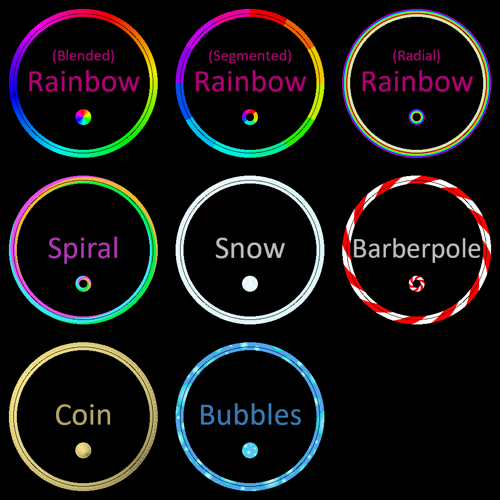
Patterns:
This is where it becomes really clear that the inner and outer ring designs are literally cut from the same base image, most evident in the bubbles ring. The pattern seems to outright ignore the gap in the middle. For the segmented rainbow, the harsh cuts all occur at 30 degree intervals, meaning they exist behind pips on the actual watchface, leaving the impression that each 30 degree arc is different.
I’m not happy with the radial rainbow. It doesn’t work as well as I’d like it to on the small screen, and thats probably because the ring itself is only 8px wide. You can’t do much in 8 pixels.
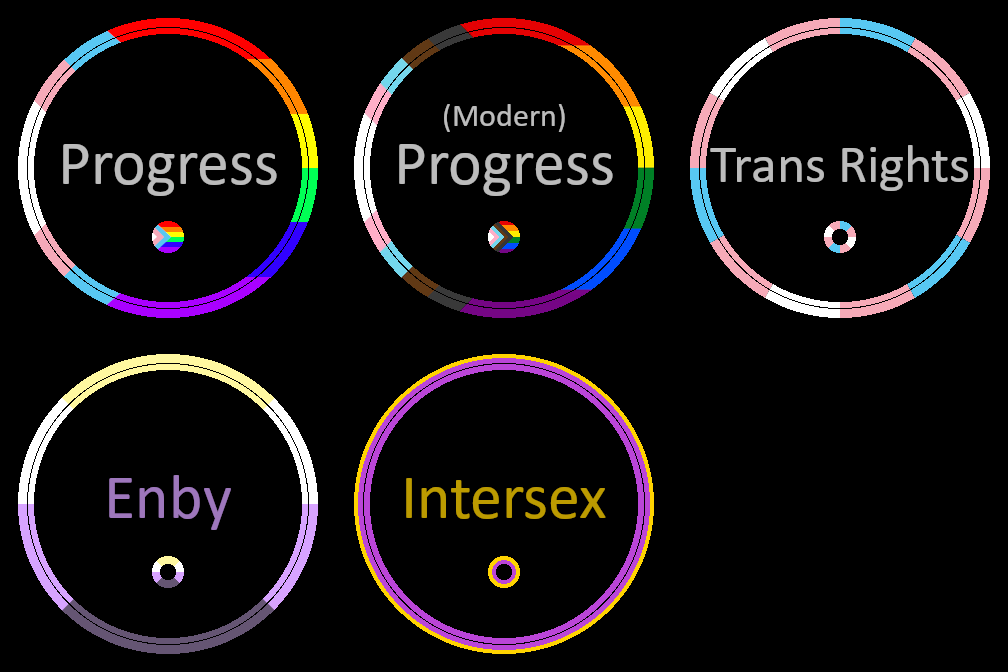
Pride Flags:
I also added a small selection of identity pride flags for people who are interested. There are two progress flags, one with the brown and black stripes, one without. The reasoning for this is that against a grey ring and black screen, these colours provide impressively little contrast, so forcing them to be used would be an accessibility disaster, but I also don’t want to leave out the people who do wish to suffer because of it, hence both versions available. Each flag has a unique design in the ring form just to add a bit of extra diversity.
I’d add more later, but there are two things stopping me. First there is a hard limit on the size of an app bundle, and these images take up >95% of the size of my app so far, and secondly once I submit the app for review, I can no longer edit anything about it, so I wouldn’t be able to change it even if I wanted to.
Quality of life:
I added a counter that can be set by the settings module and read by the render function called “preview_ring_display”. Usually it sits at 0, but when the ring style changes it’s set to 4, and when it’s positive, the draw function sets the arc span to 360 and decrements it. This has the effect of being able to see the full ring’s design for about 2 seconds after it’s set. Makes choosing a vibe a bit easier.
Bonus Meme
I accidentally left the emulator on for like, a week, while I’ve been preoccupied playing shitty idle games on Steam, and uh, now the step counter looks like its own idle game lmfaooooooooooo
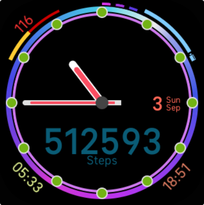
half a million steps isn’t bad for one day 🙂
You wont see me adding 50 dashes around the outside to account for this though lol.
Leave a Reply