So for the last couple years, I’ve had myself a Fitbit Versa 2 as my watch of choice, and on it, I had a watch face that I like that does a lot of cool stuff. This watch face is called Hourly Steps, by MC11010, and it’s done me very well for the last 3 years or so, but recently I’ve upgraded my watch from a Versa 2 to a Versa 3. Normally you wouldn’t think this is a big deal, but here’s the thing.
The Versa 3’s screen is 36 pixels larger in each direction.
And because of that every single app and clockface built for the Versa 2 are not available to me anymore.
Oh it also might have something to do with how the API and OS version has changed and introduced breaking changes, but I’m going to believe it’s becase of the screensize.
So since nobody else has created a similar watch face, and MC11010 hasn’t stepped up to update their existing code, I guess I’m going to have to do it myself.
Lets see what we’re working with.
Hourly Steps by MC11010
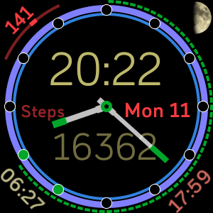
Now there is a lot going on here, let’s unpack it all.
- In the center is an analogue clock. Great start.
- Above is a digital clock.
- Below is a statistic number.
- On the right is the day and date.
- On the left is the label of the statistic number.
Now one of my peeves with this layout is with the settings included, and the ability (or rather inability) to hide individual elements. The digital clock and number are tied to the same colour selector, the label and date are tied to the other colour selector, and the label and the value it’s describing aren’t linked at all.
Let’s keep going. In the bevel of the watchface, there are 3 rings and some dots.
- The thin inside ring are the steps in the current hour, with a full ring representing 250 steps.
- The thick middle ring is the steps for the day, with a full ring being the goal that’s set up on your account (by default 10,000 steps).
- The dashed outside ring is the battery percentage remaining.
- The dots represent hours where the 250 step target was reached.
This does a lot of stuff right, but again, I have some qualms.
The hourly steps, as suggested by the name, is the main feature and the most important one. This is perfect, this is my baby, and as I learned during the process of developing my app, I suspect it was also MC11010’s baby too.
But the outside ring filling up, well, Pros – it tells you progress to goal. Cons – Thats it. More than once I’ve had to turn the numbers (and by extension the digital clock) back on to see how far over my goal I was, whether I was on ~12k or ~18k. We can fix that going forward though.
And the battery meter. I’m not a fan of how much space it takes up, but it does one thing really interesting (that I suspect might be a minor oversight tbh). The ring is completely empty when the battery reaches 10% remaining, and then fills backwards. I suspect the emptying at 10% is intentional, but the reverse fill might be a bug, either way I love this (potential) feature, and I want to make it a proper feature in my version.
And lastly, the very outside elements:
- In the top left is a
health barheart rate monitor. - In the top right is the current phase of the moon.
- At the bottom is the sunrise and sunset times.
I want to make these toggleable. I suspect at least one person using this clockface has a use for each of these, but personally I could happily drop the moon phase indicator. I’ll keep it in for people that do need it, but disable it by default. Also to note, that since the battery meter needs to fit between the bevel and the heart rate monitor, there is an uncomfortable gap most of the time between them. This applies to all elements, but is expecially bad for the HRM since it’s the first one that the battery ring passes.
Fitbit Versa 3
The main difference as stated between the Versa 2 and 3 is the size of the screen.
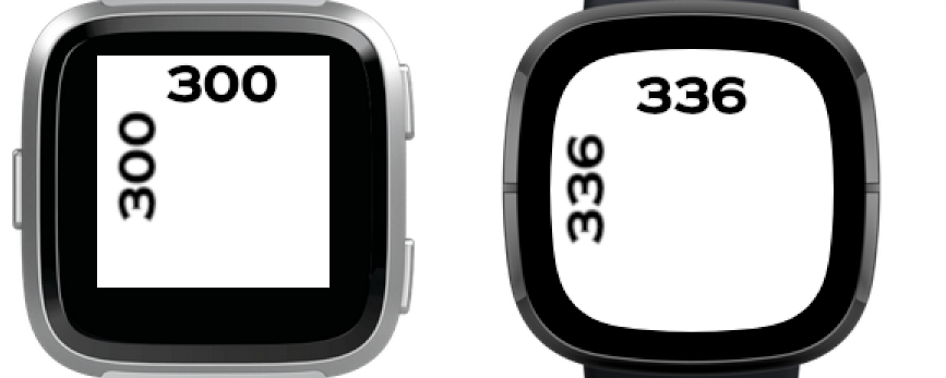
(Image depicts a Fitbit Ionic, but it is the same resolution as the Versa 2)
As you can see, the screen of the Versa 3 is slightly larger, and also includes rounded over edges. Not entirely ideal, but we’re writing a broadly circular clock face anyway, so this will work just fine for us.
So how on earth do you intend to do this?
Mostly following the “getting started” and various other guides on the Fitbit developers website.
For this recipe, you will need:
- 200g of Node JS.
- 2 whole large NVM.
- 600g of Javascript.cd
- 300ml of Fitbit branded SVG.
- An electric hand terminal capable of blending our mixture with some NPX.
- An emulater lined with some parchment paper.
Jokes aside, most of the code is going to be JS with SVG being used sort of like HTML to render the output.
There is a bunch of setup first to download dependencies and set up the emulator, but those are mostly just following the Getting Started guide. Though something I learned the hard way as a developer on Windows, if you try and set up your app and npx fitbit terminal inside WSL, the emulator won’t be able to talk to it properly.
Oh and while the guide suggests not installing companion tools, for my purposes, I did indeed need them mostly for settings management.
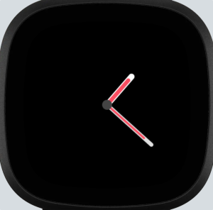
My First Basic-bitch-ass watch
So I followed the guide for the most basic-bitch-ass analogue clock off the fitbit developer docs clockface guide, and ended up with this:
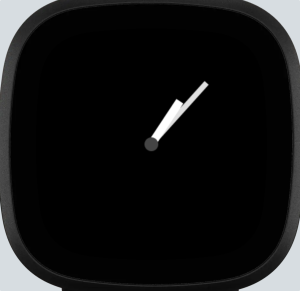
I guess it does it’s job. Let’s look at the code.
// app/index.js
import clock from "clock";
import * as document from "document";

clock.granularity = "minutes";

let hourHand = document.getElementById("hours");
let minHand = document.getElementById("mins");

// Returns an angle (0-360) for the current hour in the day, including minutes
function hoursToAngle(hours, minutes) {
  let hourAngle = (360 / 12) * hours;
  let minAngle = (360 / 12 / 60) * minutes;
  return hourAngle + minAngle;
}

// Returns an angle (0-360) for minutes
function minutesToAngle(minutes) {
  return (360 / 60) * minutes;
}

function updateClock(now) {
  let hours = now.getHours() % 12;
  let mins = now.getMinutes();

  hourHand.groupTransform.rotate.angle = hoursToAngle(hours, mins);
  minHand.groupTransform.rotate.angle = minutesToAngle(mins);
}

clock.addEventListener("tick", (e) => {updateClock(e.date)});
<svg file="/resources/index.view">
  <g transform="translate(50%, 50%)" id="watchFace">
    <g id="mins">
      <rect x="-4" y="-120" width="8" height="120" fill="#e0e0e0"></rect>
    </g>
    <g id="hours">
      <rect x="-6" y="-75" width="12" height="75" fill="#ffffff"></rect>
    </g>
    <circle r="10" fill="#444444"></circle>
  </g>
</svg>
I don’t know how much of this is MDN standard SVG and how much is Fitbit specific, but I’ll try to explain.
<g> indicates a group element. It can be moved, rotated, hidden, etc, and it’ll have that effect on all it’s children, so anything inside the transform(50%,50%) block will have it’s coordinate space centered around the center of the screen, and span 168 units in each direction (not accounting for screen shape.) By centering the rectangles for the hour hand around 0,0 and then rotating those hands using “groupTransform.rotate.angle”, we can be sure the rectangles will pivot around the local origin, which is the center of the watch face.
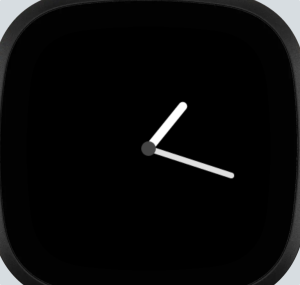
But enough of that, these watch hands look mid af.
The original clock face had each hand constructed out of 3 rectangles. A slightly wider one in the middle, a slightly narrower one as the stalk of the arm, and then a slightly wider coloured one as the tip. It does it’s job, and don’t get me wrong, I like it, but I want to do something a bit more styalised for my watchface. Let’s see if we can add some circles to round over the ends of the hands.
To add these, I simply added one line of code inside each of the group elements:
<circle cx="0" cy="-120" r="4" fill="#e0e0e0"/>It’s a very simple trick, and it relies on how as long as anything we change sits inside the group, it’ll be rotated along with everything else to create the watch face. It already looks a little bit nicer, but let’s get some colour in there. One of the settings in MC11010’s version is that you can change the colour of the hands, so we need some colour in our’s to achieve feature parity.
Wonderful. I decided to style this based on the sort of physical watch where the hands have a small indent running through the center in order to give it a little bit of depth, so I do like the design personally. In terms of implementation, same trick again: Add more stuff to the group so that it rotates as a single unit. We’re now at each watch hand having 4 elements, which is already more than the original so I’ll stop here. Or I will after I make one more change. I want to add a small amount of overhang to the minute hand, like the original has. It adds a little bit more interest without adding more complexity.
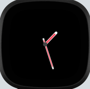
Much nicer. I’ll call the clock hands done for now. We’ll come back to them later though when we start implementing customisation.
Fitbit invented some new SVG nonsense that I didn’t realise until I swapped from the MDN docs to the Fitbit docs.
AKA Why I spent way too much time trying to round over the edges of that clock above (the times in the screenshots are lying, I had to manually recreate development screenshots because I didn’t make such early dev screenshots first time around.) Basically I spent an hour or so trying to make the “rx” and “ry” arguments of “Rect” work, and they just weren’t.
So what are the differences between MDN SVGs and Fitbit SVGs? Pretty much everything. Here’s what MDN SVGs have that Fitbit can’t do: Almost literally everything.
But on the other hand Fitbit has <Arc>
Impressively, this is a far far bigger thing than it seems.
To draw arcs in normal SVGs, you need to first draw a circular wedge, and then draw another on top to cut out the circle, but in Fitbit land all you need is to define the bounding box of the circle/oval that the arc traces, and it’s start and sweep angle. This is where the bug with the battery wheel in the original version of Hourly Steps will have cropped up from. It’ll have figured out the % filled, then multiplied by 360 to get a sweep angle and just written it directly without a bounds check, so when it was seeing “oh we have -5%” it was converting that to a sweep angle of -18 degrees.
Anyways, we have arcs now, let’s put them to some use. I’ll design the elements of the clockface first before making each part functional. More or less everything is going to be inside the big outside translate(50%,50%) group though since it makes sense to normalise everything.
First job, the bevel. I won’t do the battery ring because like I said above, I don’t think a ring makes sense for the battery meter. The bevel also needs to include the 12 “pips” for the in-hour target lights, and while I could try to manually figure out the x and y coordinates of the pips, I also have tools already for placing stuff at a specific angle relative to up, it’s groupTransform rotate. So instead of having 12 circle pips with different x and y values, I can have 12 pips with different rotations. Each pip needs to be a colourable circle, and then it’s border. Fitbit SVGs don’t have a border property, so to set up the borders on the circular pips, we’ll just put the pip colour on top of a border colour circle. To note, since I don’t manually set any layering options or Z-values, things defined first are drawn under things defined later.
<arc x="-140" y="-140" width="280" height="280" fill="#505050" arc-width="4" start-angle="0" sweep-angle="360" id="innerBg"/>
<arc x="-140" y="-140" width="280" height="280" fill="fb-blue" arc-width="4" start-angle="0" sweep-angle="0" id="innerBar"/>

<arc x="-150" y="-150" width="300" height="300" fill="#505050" arc-width="8" start-angle="0" sweep-angle="360" id="mainBg"/>
<arc x="-150" y="-150" width="300" height="300" fill="fb-aqua" arc-width="8" start-angle="0" sweep-angle="0" id="mainBar"/>

<g transform="rotate(0)">
<circle r="9" cy="-141" fill="#e0e0e0" />
<circle r="7" cy="-141" id="pip0" fill="#000000" />
</g>
<g transform="rotate(30)">
<circle r="9" cy="-141" fill="#e0e0e0" />
<circle r="7" cy="-141" id="pip1" fill="#000000" />
</g>
<!-- Repeated 10 more times -->
A sweep angle of 360 just creates a full ring. The reason we have 2 of each bar is because one of them is the grey background and the other is a coloured part ring that will fill up over time.
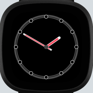
And just like that, we’re starting to look a lot closer to our target.
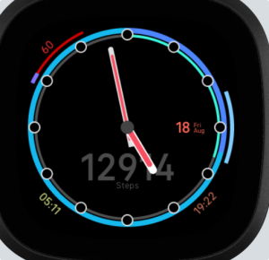
For the heartrate and battery bar, we can also use arcs, but with an offset start angle and a shortened sweep. Oh and from here on, I’ll be using mostly my original development screenshots, so if I skip a few steps, assume it’s for document flow and to speed things up, since to be honest, at this point, we’ve more or less got the basics down, and I wanna talk about some of the challenges I encountered whilst working on this, so I’m going to jump ahead to when I added a bunch of the other elements
1, 2, *snaps finger*
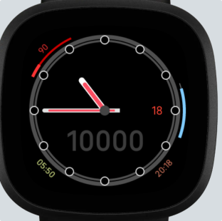
So what have I added:
- Heartrate monitor top left consists of two 40 degree arcs on top of eachother, and a piece of text that’s placed outside the clock face and rotated -45 degrees into place.
- Battery bar on the right again, two 40 degree arcs on top of eachother.
- Sunrise and sunset time placeholders are just text that is placed below the clockface and rotated 45 and -45 degrees into place.
- Day number to the right is just a text element.
- Big steps number is just another text element.
Cool, now make it schmoove.
Now I’ll be the first to admit, I used a lot of resources whilst working on this, but thankfully Fitbit provides a lot of resources. Lets take a look at this one. This is a first party clockface called “Moment” and it comes if not pre-installed, very prominently placed on the gallery. It includes a few important things for us: A way to set up settings, and a way of using the heartrate monitor built into these trackers.
That being said, I have taken more or less as-is the files at app/simple/hrm.js, app/simple/device-settings.js, and the exactly one function in app/simple/util.js that everyone uses. I’ve also nabbed companion/simple/companion-settings.js, which together with device-settings should handle the setting management and saving. It’s not like I don’t understand what these are doing (mostly) though, I had to do a bit of introspection into them to see how they were doing things like saving local files (foreshadowing.)
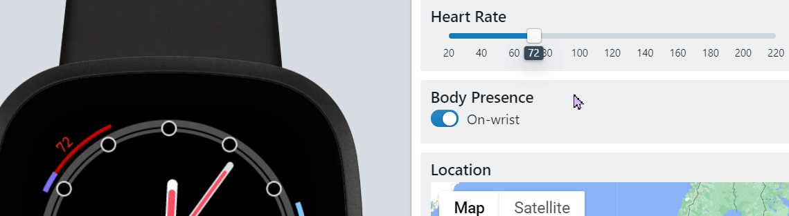
With these in hand, I was able to set up a heart rate monitor. The Fitbit simple files work by just calling the module “initialize” function with a callback you want to run every time a reading is taken. I did make a small change to have it pass the max heart rate from the user object as the data bundle for the callback though.
Most of my logic involves calculating based on the current, resting and max heart rates how far to sweep the heart rate bar. At rest, the bar is ~1/8 filled, below that it lerps to 0 (though it’d be better if I made it lerp to some more relevant value such as 10% below resting.) Above that it lerps to the max heart rate, topping out at or above the max heart rate. The other thing the function does is change the colour to yellow, orange or red depending on if the user is in the fat-burn, cardio, or peak zones. Everything else such as shutting the HRM off when the screen is off is handled by the Fitbit simple hrm module.
The emulator lets me change the sensor’s heart rate reading.
The battery meter is slightly easier to make move, as I can just directly hook a callback into the battery object’s onChange method without much issue, and then I can read the current battery level from the battery object to figure out how far to sweep each bar, though since the bar starts at the bottom and moves up, my maximum sweep angle is actually -40.
My update battery function first grabs the charge level, then compares it to the configured battery reserve level, which before setting up settings is just 15%. When it’s above the reserve percentage, all is well, it’ll figure out how far the bar needs to be drawn, and also what colour to draw it, since below a certain amount, the bar wants to be orange instead of blue. Below the reserve threshold, the background bar turns red and that starts draining. This is how I decided to canonise the bug behaviour of MC11010’s watchface where being below the battery threshold started drawing the bar backwards.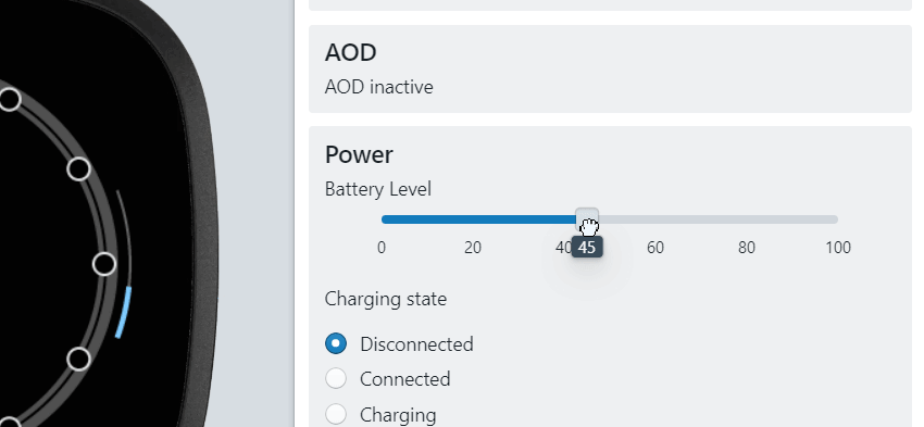
The date is just a simple write a few bits to <Text> elements. I also decided to reorganise the date indicator and add in day and month labels, since unlike the Versa 2, the Versa 3 actually doesn’t show you the date/month anywhere other than on the clockface. On the Versa 2, you used to be able to see the date and battery in the notification center, but now you only see the battery in the quick settings, and the date is nowhere to be found.

It looks something like this, but after doing some hardware testing, I made all the fonts bigger, so it’ll be a bit larger in later screenshots.
More stolen code
It wouldn’t be programming if you weren’t using someone elses work. I wonder who programmed StackOverflow and if they used StackOverflow when they needed help.
It turns out that sunrise, sunset, and moon phase can all be calculated on the fly using nothing more than the current time and location, and Fitbit devices have GPS support. So to create the sunrise and sunset times, I used sun.js from this repo, While it’s a little bit jank, it does the job. It requests the GPS location, caches it to a file, and returns the sunrise and sunset times for a given date. When I implemented it, I added one extra feature: Tapping on either of the times will forcibly rerun the code that fetches and caches the GPS location. This allows the user to refresh the GPS data whenever they need to.
While at this point in the development cycle I did not have plans to reintroduce the moon phase indicator, I decided later on that I may as well, since every other element could be toggled by a switch in the settings, so the code for that was taken from this Medium article, which I cleaned up the formatting and added some export function statements to bring the code into app/index, and then I simply take the output of “getLunarPhase” (which I’ve edited to return a number from 0 to 7, not as a name) and use that to update the href of an <Image> element.
Oh my god trying to figure out steps in hour is a nightmare why did they make it this hard?
So when you want to look for activity, heres what you get access to:
- An “activity” object which tells you the user’s current statistics, as well as what their goal targets and primary goal metric are.
- A “dayHistory” object which tells you the statistics the user achieved in the last 7 complete days.
- A “minuteHistory” object which tells you how many steps the user got in the last 60 complete minutes.
Notice anything missing here? Thats right, there is no hourHistory *sarcastic party whistle*. That makes things a whole lot harder…
Here’s the plan:
- Figure out how many steps the user is on and remember that number’
- Wait a couple seconds
- Figure out how many steps the user is on now, compare it to the previous number, and add the difference to a tally
- Reset the tally every hour.
This took a lot of time to debug, because the debugger would keep disconnecting before I reached any meaningful data, and I don’t get debugging details from the hardware watch at all when the debugger disconnects, and issues take a couple hours to show up.
Tips though: when saving dates as CBOR values, convert them to strings with their toJSON function first, because the CBOR converter built into the filesystem api doesn’t automatically call toJSON functions for you. That fixed most of my data saving issues. As for how I actually wrote the data save function, I just copied what sun.js was doing, setting a couple of event callbacks to save and load, and going from there, and then that gets us the In Hour stuff.
I can then bundle that up with the activity and goal values, and write an activity.js module with the same interface as simple/hrm that initializes with a callback to fill in the rings.
And now the rings are filled in, wonderful! The emulator fills in dummy data for steps, as well as increasing the value over time in order to test that things work properly. The main big improvement though over MC11010’s original is that once the goal is met, the background ring changes to the colour of the main ring, and the main ring picks a darker color. This allows the user to see how far above the goal they are!
I also added a small label below the number for what metric is being shown (I brigten the colour in later screenshots.) This fixes the issue I had with the original design where the label and value were incredibly disjointed and didn’t really fit together well.
Tapping on the screen makes it change what metric is being shown. I added a transparent circle the full size of the clock face in order to ensure all taps are captured, since otherwise taps only count if they’re clicking on a visible object. That was actually another flaw with MC11010’s original design that made it slightly difficult to change the visible statistic. Note on differences between “transparent” and “not visible”. A transparent object is one with opacity 0: It is still there and active, and still listens for taps. An invisible object is one with display “none”: These are not drawn at all and therefore don’t capture taps.
So functionally, my watch face is now done. Next job is to make it fancy.
Making it fancy
Remember at the very top of the page how I said the getting started guide suggested not including the companion module? Well we need it, and this is why. The companion module is how settings work, and I took the pair of setting scripts from fitbit in order to handle them. Those scripts does all the device communications and local save/load of settings, and again are just initialized by passing a callback function. The settings are defined as a JSX file, which tbh I don’t entirely know what it means, but I do know that someone at work used it to set up MUI-X once.
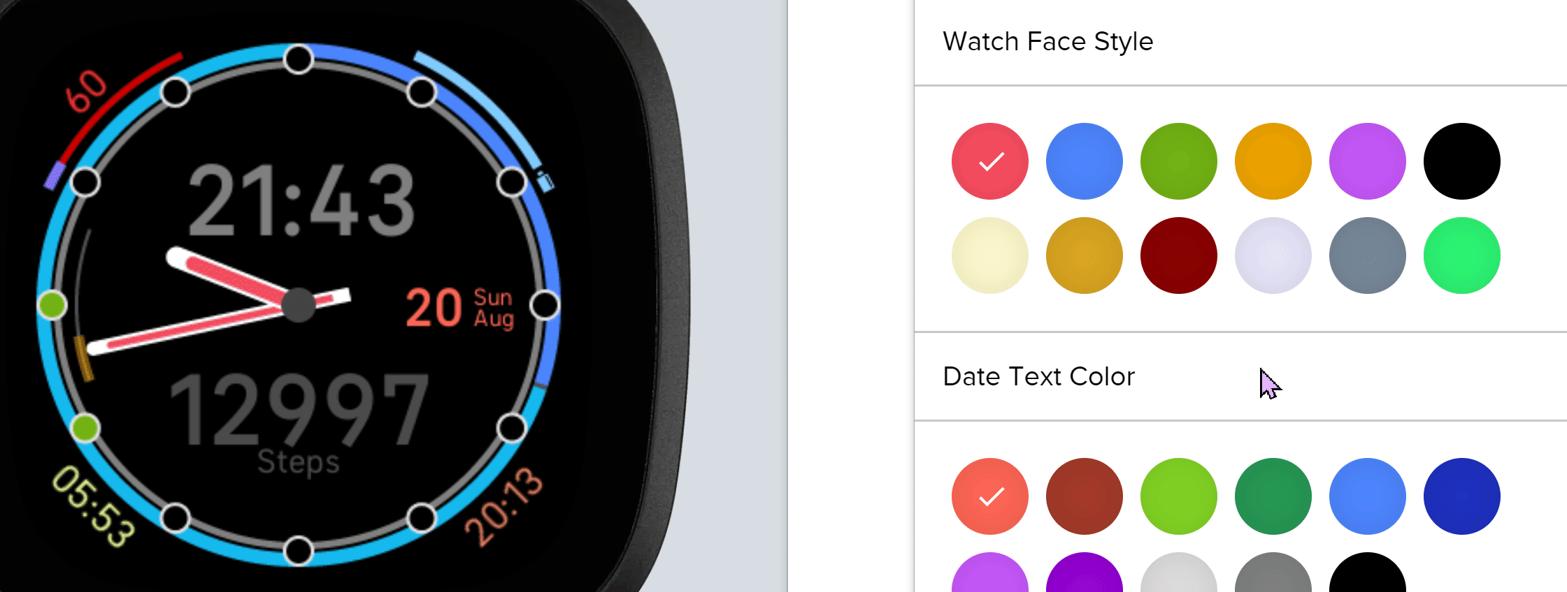
So mostly I just followed the example script from the Moment repo and leaned heavily on the documentation for how to lay it out, and at the end of it all several colours can be chosen, and elements can be individually turned on and off.
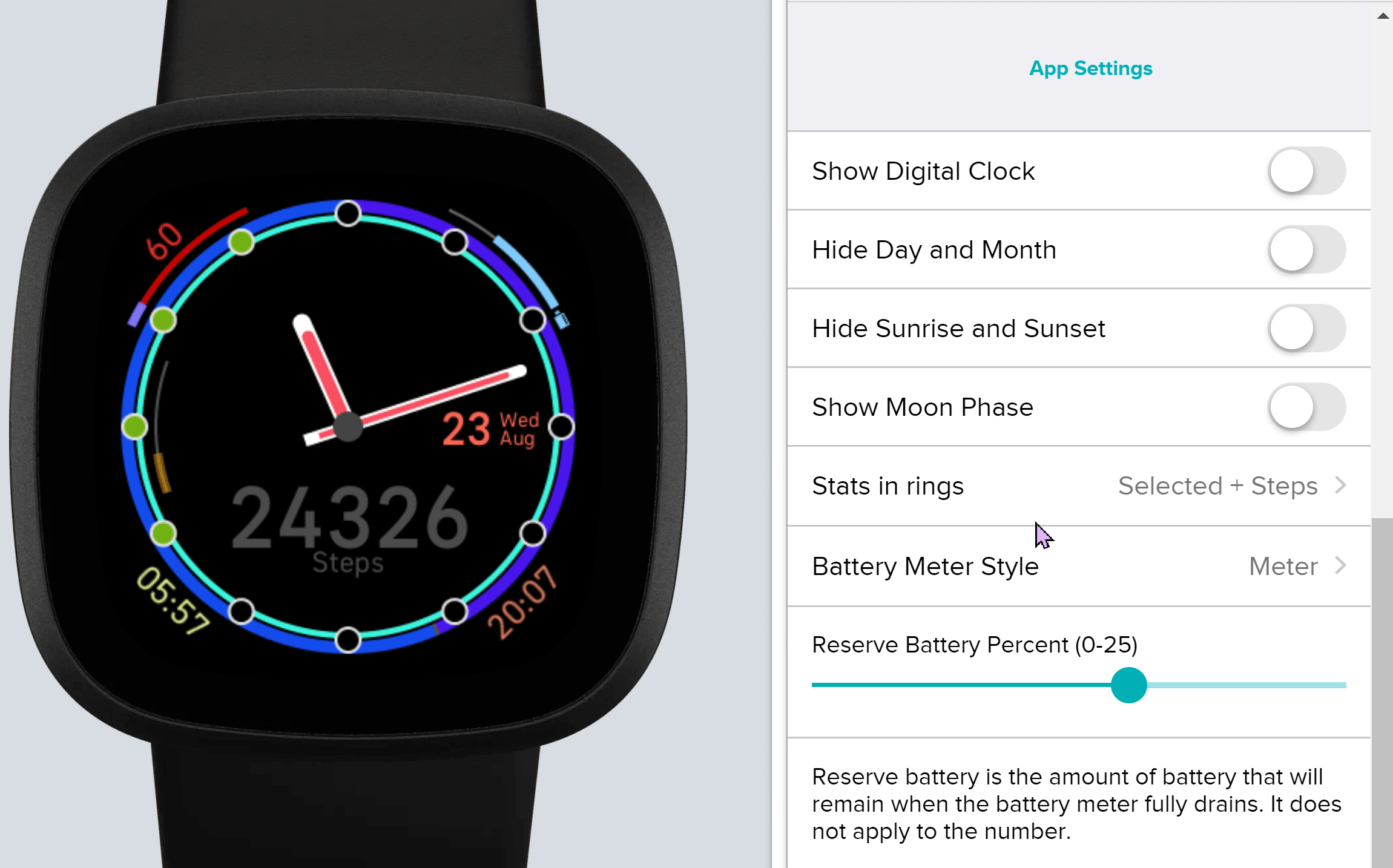
First up, watch face style: These colour options change the colours of the clock hands, as well as the text colour of the optional digital clock which oh yeah, I added an optional digital clock for this section.
You’ll also notice that I added an icon to the battery bar, those are just tiny little 6×12 2-colour BMPs for a blue regular battery, a yellow mostly empty battery, a red battery with a small ! and a blue battery with a charge symbol in it. I also moved the battery bar to the top right to balance out the display a little bit. When the moon phase is turned on though, the bar returns to the right edge.
One other thing you may notice in this updated screenshot is the small yellow bar on the left. This is just for my own debugging to help track down memory leaks, and it displays the amount of RAM the watchface is using. In the current build, it’s behind a setting labeled “Show memory debug”, but when I get the watch face properly published, I’ll remove it.
The last thing to notice, is that like I mentioned above, I’ve increased the size of all the small fonts to make them easier to read.
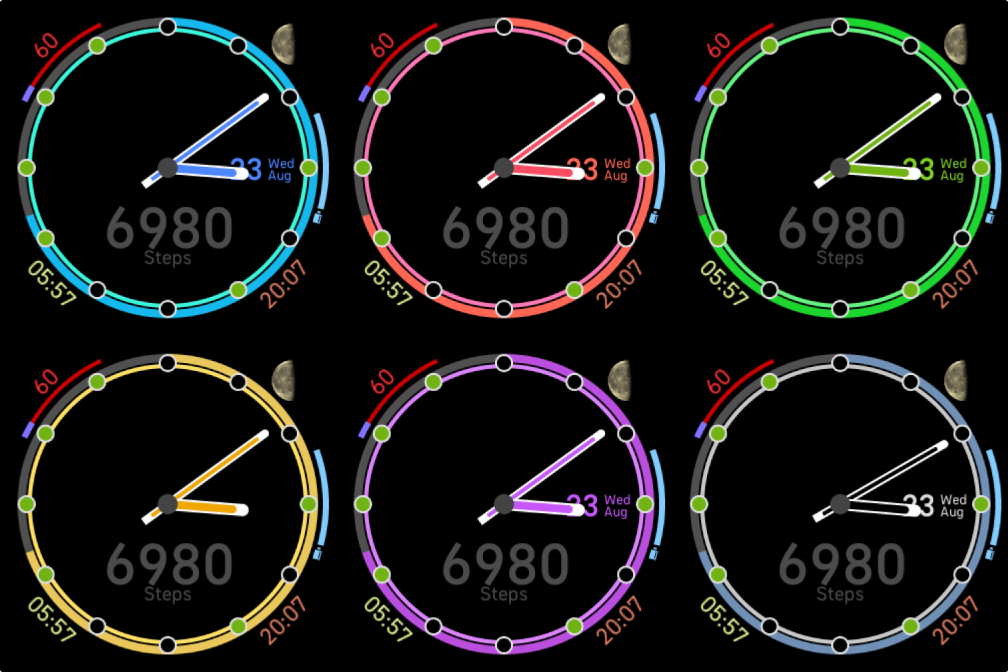
Anyways, let me actually explain my colour choices:
- red, blue, green, yellow, purple, black are all white hands with colour accents, and are used for almost all other colour options as well.
- cream, gold, and brown are meant to look like metallic watch hands, think like brass, gold and bronze.
- light purple is just because I like it tbh. Maybe I’ll add more extra styles if enough people want me to.
- The grey is an inverted colour scheme, where the white section is on the inside and the rest of the arm is darker.
- The green at the end is designed to evoke the feelings of those phosphor glow-in-the-dark watches.
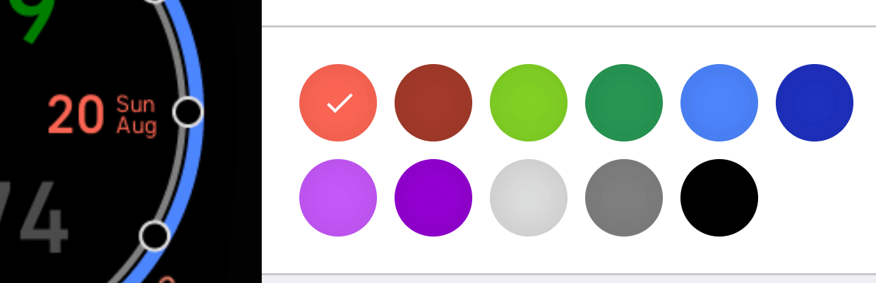
These are the same main colours (though I removed yellow here to fit a “hide” option.)
Like I said, the only colour that doesn’t match is the date in yellow. Everything else editable has at least all 6 colours.
This is also where we see the moon phase indicator, in the same place it was originally, and how when the moon phase is displayed, the battery meter shifts 45 degrees to the right side.
Lastly, lets make some elements toggleable.
And I’m done!
Thats the clock face.
Maybe I’ll think of more things it could be doing, maybe it’ll lead to the top right being a dropdown between moon phase and some other combination of options.
But for the time being, I’m happy with this.
Here is the link if anyone reading owns a Versa 3 and is interested in trying, and if anyone wants source code, send me an email (lanta@rockett.space) or DM or what have you and I can send the source over.
Potential things I might be able to change?
Maybe some kind of text size selector to make all the smaller text bigger?
If I can figure out how to interract with the companion internet or other watch apps/data, maybe I could figure out what the weather is and put that in the top right, but it’d be hard to figure out where to even start…
Another option to put in the top right extra slot is perhaps a permanent other metric meter that would always be displayed, such as active minutes or miles travelled?
Oh and also more colour schemes, maybe I could even implement a light theme for the people who think an OLED screen should go through that sort of abuse. Leave a comment if you want to see a particular colour scheme.
Maybe I could also create an always-on-display version, though I’d need to look through the requirements for that, and submit for an extra layer of approval. Could hide everything except the watch hands, the current and 12-o-clock pips, and the steps in hour bar. Make the always on display be similar to the second or third dev screenshot.
And lastly, a thanks,
A thanks to MC11010. I have no idea who you are, or where you hail from, but the watch face you designed many years ago has been a companion to me for many years, and I hope you’re okay with my work to help bring it forward, at least in spirit if not in pure form, into the future for many more. #Free4all.
Lanta write a blog post less than 4000 words challenge (Impossible.)
Leave a Reply