It’s been a hot minute, I burned myself out on Turing Complete, as any ADHD person would hopefully understand.
Anyways, Reddit shot itself in the face and Twitter is on the verge of dying pretty hard, so all my internet junkfood is being taken away and I need something to keep me occupied, so I’m gonna finally make a start on a project that has been in the ideas bin for a few weeks now: A game agnostic score submission website tailored for Tetris fanclones, named Put The Block.
I’ve been squatting puttheblock.live for a year or so now with the intention of pulling this off but never had the motivation to commit to it. But just as I was doing some really good progress, work implemented time tracking and it has absolutely sapped, like, all my energy, so to keep my focus while I’m incapable of writing code, I’m gonna write a dev log instead.
I’ll post two posts today, This one will be the plan, and the next will be my progress in the implementation. Strap in lads, lets get going.
Figma Balls LOL
Also known as “I have no will to continue on in this world and I will make dumb jokes all I like because it’s the only thing keeping me sane right now”
A good way to do planning that I’ve learned from work is to just fuckin, dump all your ideas into a workspace, and figure out how they all connect and work together, so lets figure out what we want.
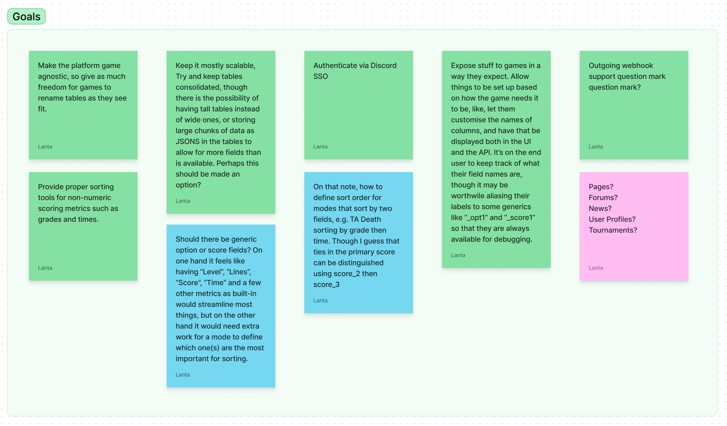
Gah this all feels far too formal tbh, and dont worry, this is pretty much the only part thats like this, and also some of it is wrong because I’m dumb and most of this was written in uhhhh, I want to say Feburary? Lets say Feburary.
More broadly, heres what I want for Put The Block
- Tbh its just speedrun.com but with more options for default sort orders on the tables, and more tables for each game
- Seriously, thats it lol
Okay I’ll elaborate. These parts are a must:
- A user should be able to log into the website, except I don’t want to have to roll my own auth or store passwords, so I’ll use Discord as an SSO provider.
- A user should be able to connect a game that supports PTB into their account in order for the game to upload their scores.
- A user should also be able to upload scores directly to existing game leaderboards in the case that the game itself doesn’t support PTB.
- Each game should have a set of managers that have control over the game, its modes, and its submissions.
- Each game should have moderators that can approve or reject submissions.
- Each game should have one or more modes (leaderboards).
- Each mode should have one or more columns.
- These columns can be either filterable (or non-filterable) dimensions, such as the rotation system1 being used, or a sortable metric such as the user’s time or score.
And thats the niave list of what the site needs to do as a must, of course this will end up being expanded upon as I develop the site and encounter various challenges to work around.
I also have a few desires that would be nice to have, but not strictly necessary:
- Pages, editable spaces for the mods to write rules, details, FAQs or other relevant information.
- News, a simpler feed of posts the mods can use to announce things like game updates or rulechanges.
- Forums, a, well, a forum, what did you expect?
- Perhaps some bbcode support for all three of these.
It’s gonna be a lot of work but I think I can make it happen.
Sketching Up Plans
So ya guy, ya pal, ya pristine beacon of AuDHD non-binary finery (my title now, Commander) got himself a drawing pad.
And by “got himself” I mean my partner had it going spare and I made it work with my laptop.
And figma has a pen tool, which is super nice.
Lets get doodling!
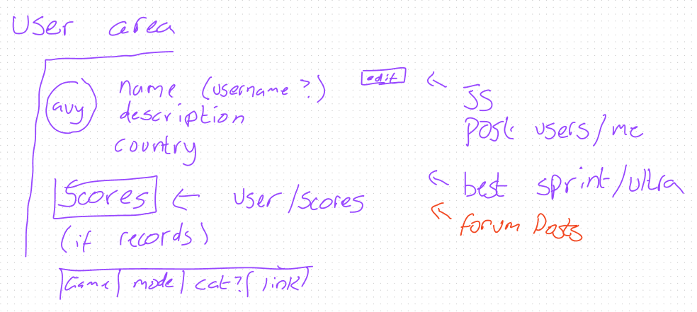
I apologise in advance for any terrible handwriting you encounter in this post, you’re just gonna have to deal with it.
So first up, we have the user profile. We want this to be a place to see who someone is, and a showcase of their acomplishments, including showing their scores, posts, maybe some other stats too, who knows. Maybe even some integrations (spoilers, there is already an integration.) In fact since this is the one part of the website I’ve already managed to make, let me give you a quick glimpse!
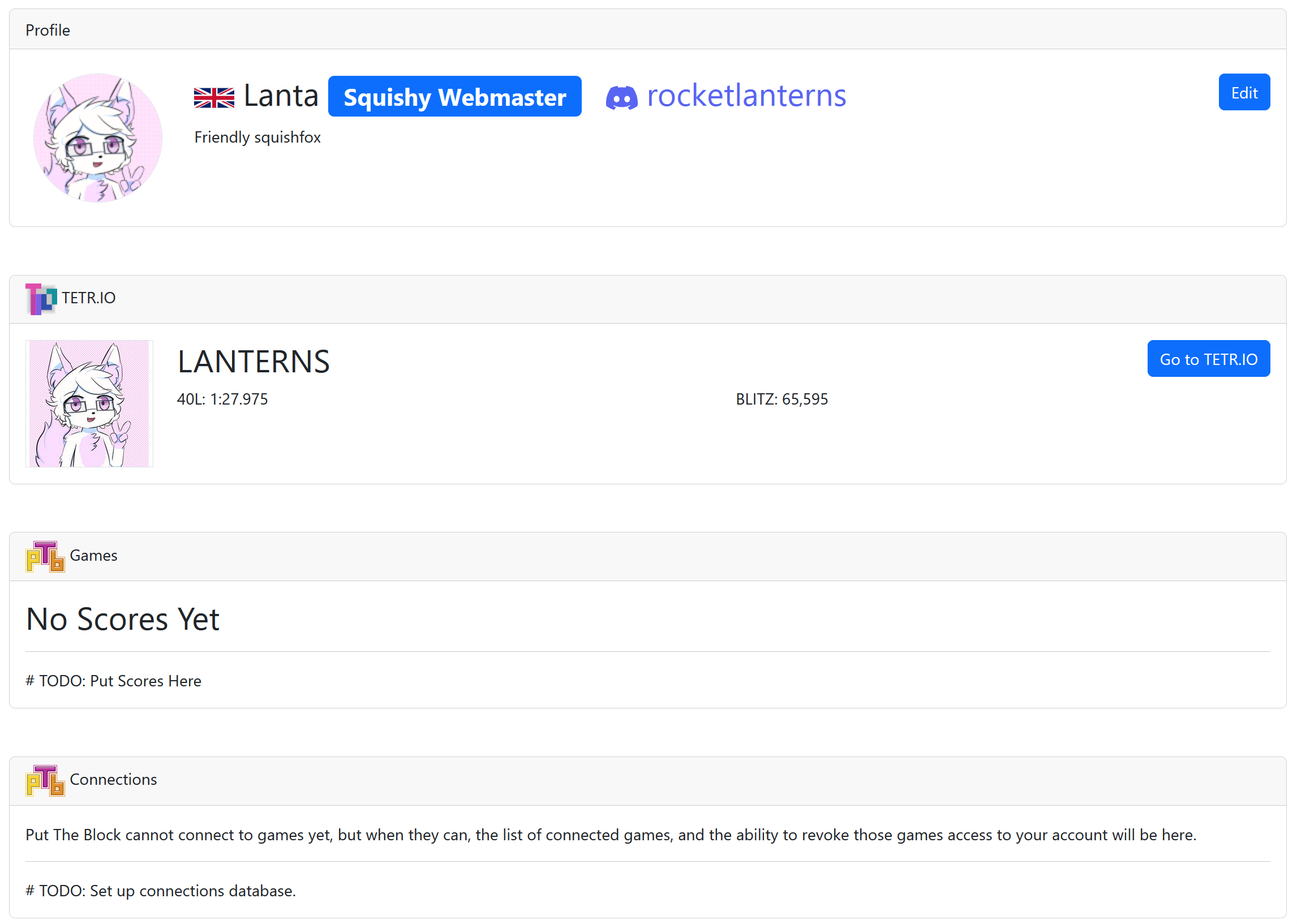
Already spoiling some features, I’ll go into more details in the more technical post. But yeah, as you can see I already have some stuff going on to connect a user account on PTB to both discord and tetr.io (though “integration” is a bit of a stretch, you just give it your tetr.io username and it fetches your scores from the public API lol.)
Also that PTB logo is something I made myself, you could be saying “hoo ha totally original make the letters out of the tetris pieces hehe haha” but I used pentominoes instead so mine is unique ????. Also the block skin im using there is a recreation of the connected textures blockskin from the now-dead tetris friends, but nobody tell ttc that kthx
And because I know at least one person is wondering, yes I am the webmaster, and yes I am squishy :3
Thats enough about the user area, what about the game area.
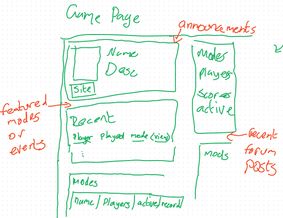
This one has a lot more going on, we want to show the game’s information and stats, we want to show all the relevant information about the leaderboards, we want to give users ways to get to the other parts of the game area. I think the best way to go about that is to have like, what, three different sections for the modes? featured modes, recent scores, and the mode list? As well as a dedicated mode page that shows all the modes a game has and also the archived ones.
That sketch above was also made a bit earlier on in the design process before we really sat down with the Cambridge (game not city) community and figured out what we really wanted, so I added some more ideas to the boards, and made a few more sketches.
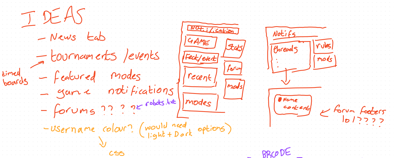
As you can see, the general idea is to have the page split up into two columns, one wider one for scores and prominent information, and one narrow one for links, extra information and a few other bits. If I was actually good at web design, I’d probably do some more nuanced navigation stuff, and unfortunately for me I probably will have to do that eventually when I finally get forums, pages, etc all implemented properly, but for now, well.
It’s All About The Cards, Baby!
So I’m using Bootstrap, and I’m bad at web design, so you know what that means, cards, cards, cards.
I threw together a non-functional mockup page so that I could get a feel for how things would look in the final product and perhaps if we needed to make any changes to the layout, and this is what I’ve landed on albeit with some plans to tweak and reorder things later on
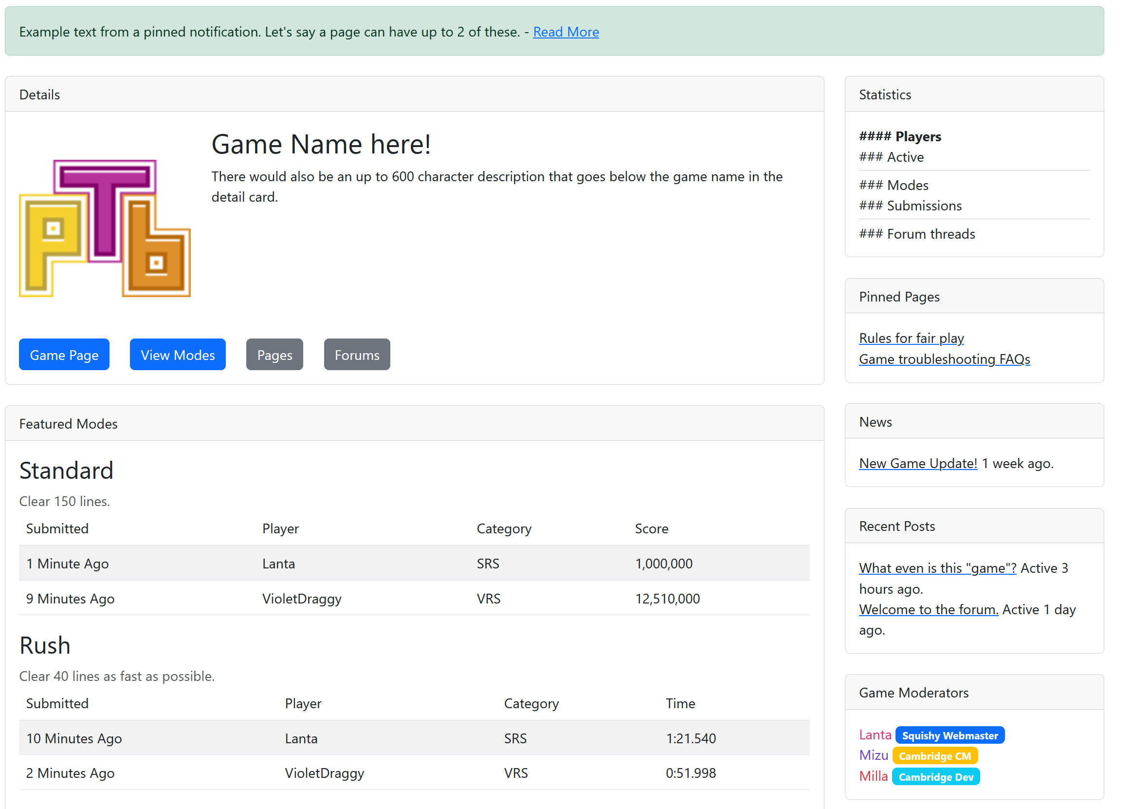
And this, this is what I mean by cards. I’m bad at layout and design, and Bootstrap has given me a way to section everything off nice and neatly into boxes. Am I wildly misusing cards from a functional UI perspective? Of fuckin course I am. Does it make a nice looking website? IMHO, yea, definitely. Dont worry tho I do use cards properly a bit lower on the page too!
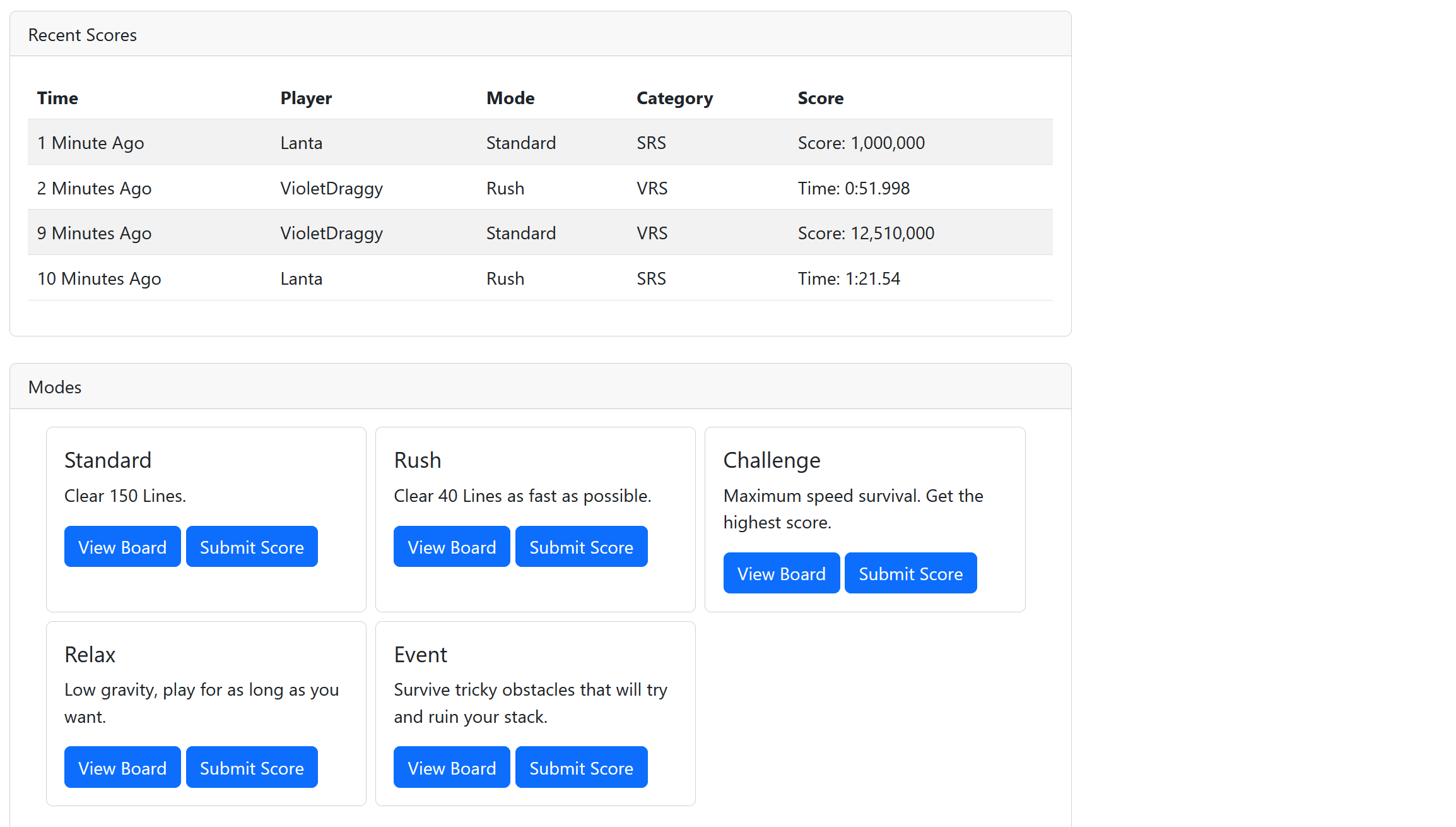
Though I must admit, embedding cards inside cards does feel just a little bit sinful lol. Absolutely no remorse though.
Honestly, even if you look at the screenshot of the user page above, that’s also built almost entirely out of cards too, and that one doesn’t look too shabby either. Makes for a reasonably consistent design philosophy.
Still, I suspect I’m going to have to leave at least some navigation breadcrumbs to go between pages, forums, etc. but I’ll burn that bridge when I get to it.
There are a few other things that you might notice in my mockup screenshots, for instance on the right, in the “Game Moderators” box, the names are all coloured and have labels after, honestly, thats because I can and I thought it would look cool. Anyone can choose their colours, but a site admin has to apply the lil banners afterwards, since theyre to be able to tell apart important community members like moderators, organisers and developers.
Okay, But How Much Planning Is There Really?
Like, this? lol, tbh, I’m just kinda winging it and hoping. I’m planning out big features before I make a start implementing them, and I think we’ve hit the bottom of the list of main features we want, but until the site is actually published I don’t know how much more there will be in total. Thankfully everyone’s ideas well seems to have run dry.
As for planning out the database, I’ve been adding stuff to that pretty much since the beginning, since like, it’s super difficult to nail down exactly what you need when the list of ideas and features still aren’t finalised.
And in terms of progress, thats uh, thats kinda where I’m at. I have an admin panel to edit data directly without having to go through the near fucking useless pgadmin, or the utterly fucking broken phppgadmin that my hosting provider has available, but I still have to use pgadmin to update the structure of my database.
Have I planned how games are gonna communicate with PTB? Kinda, but nothing is set in stone yet. Authentication is so incredibly daunting.
Have I planned how to implement the game screen settings? Kinda, though I need to dig around and see how much work it’s going to take to materialise those plans and if there are better options.
Have I finalised the list of features? I fucking hope so, but I don’t doubt something else is gonna swoop in and blow up out of proportion before I have a website on the internet.
Have I planned out what other integrations to put on the user page? Not really, if another web based tetris game has a public profiles API then I’ll add it, if they don’t then I wont, simple as that.
Are you gonna add a dark theme at least? Yes it’s a setting on the game level whether it’s on or off.
The Details
You want to be bored by the details? Sure, check out this sister post.
The tone of that one isn’t going to be quite as unhinged as this one, but it might be a little bit more frustrated or salty. I’ve encountered a fair few problems (and costs) with this project, but oh well we’re in this for the long haul now.
Sorry for such a short blog post, I know my previous PPU series was reaching about 6000 words per essay, but in all honesty, I’m doing this to try and recoup some energy and keep myself going more than actually being informative about what I’m doing. Besides, I suspect the two posts I’m making today will reach about 6k anyway, this one is at like, 2000, and I have a lot of details to ramble on about.
1: A rotation system is the rules by which pieces in a tetris game rotate. While I understand that this is a quite game-specific term, and that this site is also going to be quite game specific, there is nothing stopping a user from creating a leaderboard for a non-tetris game if they so desire.
Leave a Reply